Circulation / Store planning
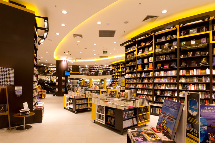
The store occupies a tricky area, whit a narrow entrance that leads into an uneven “L” shaped hall. In order to avoid a situation were we would end up with a dead area on the left end of the store, that actually represents more than 50% of the area, we carefully placed three huge gondolas, filled with books from floor to the double ceiling height, oriented in a way that the store traffic would be guided into there. We also placed the stairs that take us to the mezzanine in that position, ensuring that the important departments that are place in the vicinities will be viewed, visited and shopped by the guests.
Way finding / Graphics / Communication
At Saraiva, graphics play a very important role. Way finding and Communication are integrated with fixtures and architecture, and a decorative graphic line tops all the walls on the mezzanine area. At kids, the fixtures were custom designed, as well as all the entrance, ceiling and interactive. Phrases praising literature are also transformed in a wall background for special areas. All that contribute to create a more emotional atmosphere, reinforces the brand image and projects a sense of professionalism, order and consideration for the customer’s scarce shopping time.


